
Braille Education and Promotion
Since 2013, I have been an active member of the working group ‘Braille Education and Braille Promotion’ of the Dutch foundation ‘Vereniging Onbeperkt Lezen’. By combining my knowledge and experience of visual disabilities and braille with my professional background as a graphic designer I can help to raise awareness of the importance of braille for both children and adults.
Designing with braille
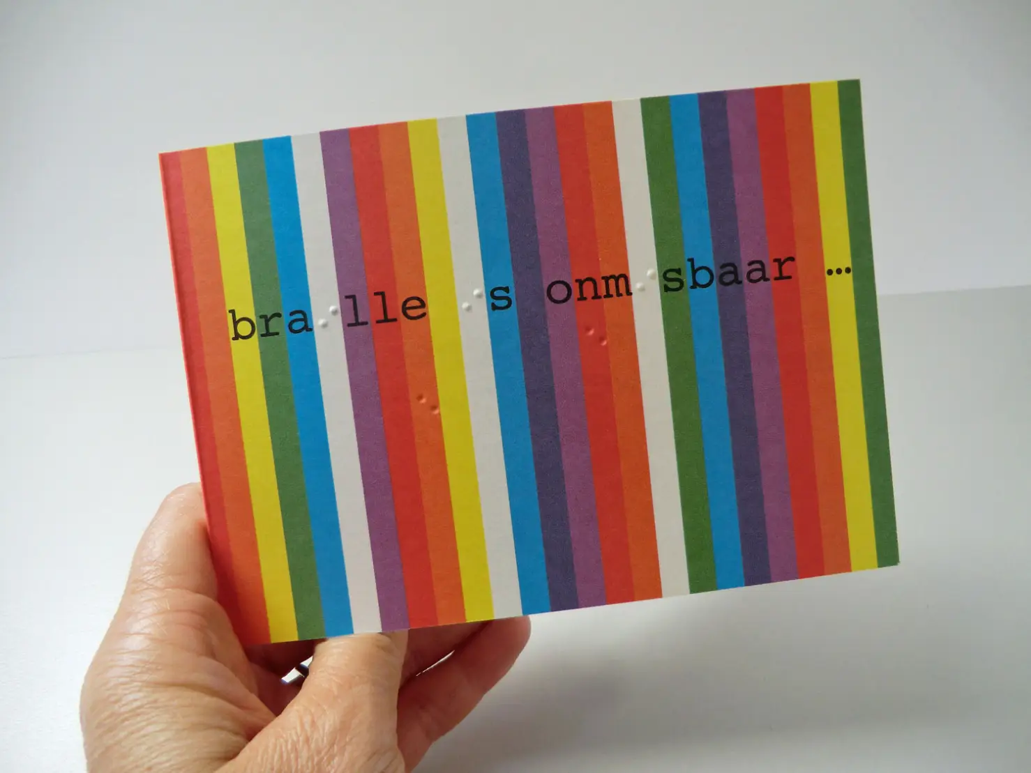
Whenever possible I incorporate braille in my designs. The use of ‘real braille’ (tactile legible Grade 1 braille) sends out a very direct message: that braille is just as important to the blind as print is to the sighted. I can’t imagine a world without words, whether printed or digital. Equally, living in such a visually rich world, it’s hard to imagine the non existence of colour, patterns, textures or any kind of imagery.
… braille is just as important to the blind as print is to the sighted.
Recognizable and accessible designs
All the promotional and educational items which I’ve designed for the VOL form a recognizable series with specific design elements. The most striking element being the colours of the rainbow, whether in strips or blocks. This symbolizes positivity and change and refers to the spectrum of light, ‘seeing’ (used in Apple’s original logo). I use a dark blue as spot colour. Furthermore all the designs take into account accessibility through clear layout and good typography. Apart from printing braille there are many subtle references to braille in the designs, for instance in the underlying grid or by using a monospaced typeface, such as ‘Courier’.
The ‘Vereniging Onbeperkt Lezen’ is a foundation in the Netherlands that provides information about literacy for people with a visual or reading disability.
Designs for braille education and braille promotion
-

Flyer, ‘Right to Read’, aimed at promoting membership of the VOL.
-

Advertisment for the 2nd VOL Braille Symposium.
-

VOL newsletter: theme number about braille users.
-

NLBB newsletter: theme number about braille users.
-

These braille bookmarks were given to children attending a reading festival.
-

After the bookmarks were printed I added a little bell on a decorative cord.
-

Braille bookmarks: one side is printed in braille, the other side in large type.
-

Many thanks to Antalis for providing the gold and silver card, ‘Curious Metallics’, for the bookmarks.
-

The principles of braille are explained in the book ‘Op weg naar braille’, printed in braille and offset.
-

Inside spread for the book, ‘Op weg naar braille’.
-

Flyer, promoting the book ‘Op weg naar braille’, incorporating braille in the design.
-

Promotional banner, designed for using on social media.
-

Promotional card incorporating a braille alphabet.
-

Following offset the promotional card was printed in braille on a Heidelberg.
-

‘I love braille’ wristbands, given to those attending the 2nd VOL Braille Symposium.


